
Normally when I do an ad or poster thing I steal my ideas from somewhere else, which I'll be sure to do again. Usually when I do an ad or poster thing I steal images from somewhere else, which I'll be sure not to do this time around for legal reasons.
The inspiration for posters comes from all over the place - things I've run across and liked, half finished photoshop tutorials, current events, whatever images I can steal online...

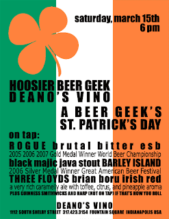
That was where it all kind of started - The HGB logo was very much influenced by the Heineken logo (some might say ripped off).
Of course the current Heineken bottle-use logo is a little more stretched, but... same idea.

I don't think Heineken has full legal rights to circles - at least I hope not - so I've always assumed we're in the clear.

This image and corresponding photoshop tutorial led to a couple of ideas. The New Year's poster used the background ray of light sort of thing originally - though the rays I created were lightning bolts, actually.. then I started throwing things on top of that...

A shot from 28 Days Later

Bart Peterson's City of Indianapolis Logo
Add some hand-drawn flames and some Photoshop layer burn and dodge tricks and you've got an event poster.


I also used the Polaroids on a background idea from that tutorial for the first header in the big site redesign.
These images should look strikingly similar. Hopefully, anyway, since I was pretty much just following half the directions.


Instead of the hands on wrench thing, I did a hand on a Schlafly tap handle. Instead of the airplanes, I put wings on a keg... and then I threw in some black stars to fill space.
Of course these never end up exactly the same - when you're messing with colors and levels you usually want to change it up at least a little bit.
I thought the following poster ended up really pretty great... the inspiration kinda carried through the whole design.


Of course my favorite bit was turning Big Car's regular old Mustang:

Into a convertible.

Putting the Kennedys in the Mustang was a little tricky, and the perspective is all wrong, but I was happy with the results anyway. It may have been in poor taste, but I suppose that's nothing new...

This Oktoberfest poster, which seemed to be popular with the warped minds of HBG, ended up in this version:

I didn't really want to offend anyone, anyway.
One of my favorite posters was this one:


Well, you can see where I got that idea.
These last three were all me minus inspiration and the little things I've picked up in tutorials - I think the difference is obvious.


So this Hops for Pops poster? A poster that will be used in ads and businesses across Indiana? That'll take every trick I can come up with.
4 comments:
I love the rodent projecting arrows. Awesome job there buddy. Igneous Rock!
that was a groundhog day poster, actually... i was going for a groundhog as the sun coming over the mountain theme.
Nice tip on the tutorials. Now I just need to get Photoshop, do the tutorials, and when the malaria takes it course, I'll be able to take your place as HBG poster maker and no one will ever miss you.
MALARIA!
You want to help redesign my site? ;) Maybe we can work something out in trade.
Post a Comment